


POSCA Colour Chart 2026: The Ultimate Guide for Australian Artists
The perfect shade of blue on your screen can quickly become a costly mistake when it arrives at your doorstep looking completely different in person. For many creators, the frustration isn't just about the hue; it's the discovery that your favourite "Glacier Blue" isn't actually available in the PC-8K broad chisel tip you needed for that large scale mural. Using a comprehensive posca colour chart 2026 australia guide is the only way to ensure your palette remains cohesive and your creative budget stays intact.
We understand that building a professional marker collection is a significant investment in your craft, and there's nothing worse than wasting money on redundant shades or the wrong nib sizes. This guide promises to help you master the full POSCA colour spectrum, from the classic primary tones to the 2026 Edition pencil sets, so you can plan your upcoming projects with absolute certainty. You'll gain a clear understanding of the 66 colour range, learn exactly which pens suit specific surfaces, and finally feel confident choosing a palette that works as hard as you do.
Key Takeaways
- Learn how to navigate the official posca colour chart 2026 australia to cross-reference every hue with its available nib sizes for precise project planning.
- Master the POSCA numbering system to quickly identify essential shades and understand the logic behind the brand's iconic colour codes.
- Discover the science of colour harmony and how to select professional colour families that elevate your work from hobbyist to professional.
- Optimise your art supply budget by learning how to match specific nib types, from ultra-fine to extra-broad, with the correct surfaces and techniques.
- Explore the benefits of creating personalised marker bundles to ensure you have the exact tools needed for your specific creative vision.
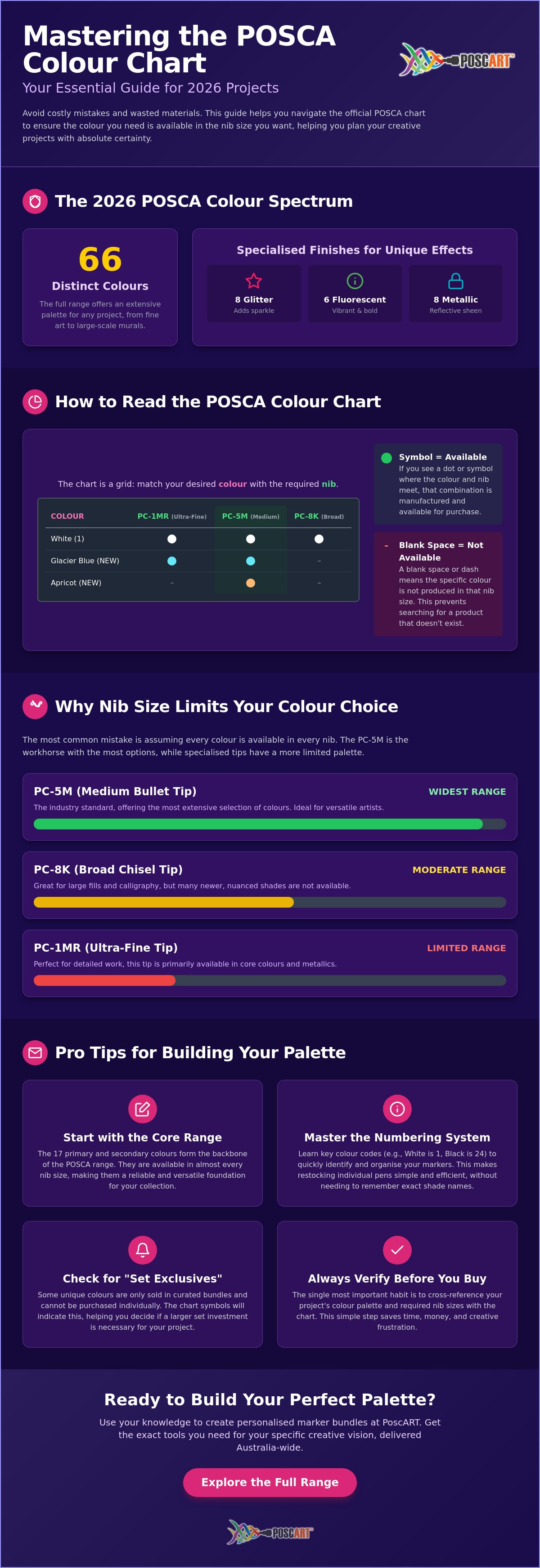
Understanding the 2026 POSCA Colour Spectrum
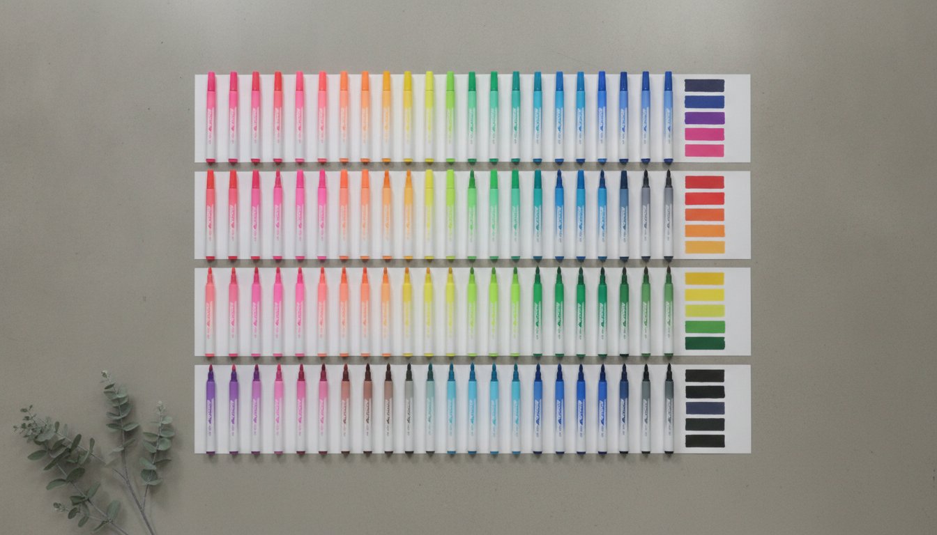
The POSCA colour chart is much more than a simple list of shades. It acts as a vital cross-reference tool that tells you exactly which hue is available in which tip size. When you're planning a large mural or a complex illustration, checking the posca colour chart 2026 australia prevents the heartbreak of designing a palette around a colour that doesn't exist in the nib you need. The current range features 66 distinct colours, spanning across standard, metallic, fluorescent, and glitter finishes. These specialised finishes, like the eight glitter options or six fluorescent tones, offer unique textures that can make a project truly stand out.
This iconic range is produced by the Uni-ball and Mitsubishi Pencil Company, a legacy that ensures every marker meets high standards of pigment quality and consistency. For 2026, it's particularly important to verify the availability of newer, nuanced shades like Khaki, Apricot, or Lavender before you start your project. These additions allow for more realistic skin and nature tones, but they aren't always available in every single marker model. Checking your chart first ensures you don't end up with a gap in your gradient halfway through a piece.
To better understand how these shades look when applied to a real surface, watch this helpful video:
The Evolution of the POSCA Palette
Artists have seen this range grow from basic primary colours into a sophisticated, professional system. The 2026 POSCA pigment formulations prioritises lightfastness, which is essential for Australian creators whose work might be displayed in sun-drenched rooms or outdoor spaces. These opaque, water-based pigments are loved for their ability to cover almost any surface, from porous wood to slick glass. This versatility means you can practise your technique on scrap materials before committing to a final canvas, knowing the colour will remain vibrant and true to the chart.
Why Nib Size Limits Your Colour Choice
Not all nibs are created equal when it comes to colour variety. The POSCA PC-5M remains the industry standard because it offers the widest selection of colours in the entire lineup. If you compare this to the ultra-fine PC-1MR or the massive PC-17K, you'll notice significant gaps in available shades. The chart is your best friend here. It helps you find "close matches" within the same colour family when a specific shade is unavailable in your preferred nib. For example, if you need a broad fill in a specific teal that only exists in a fine tip, the chart helps you identify the nearest broad-tip alternative to keep your project moving.
Decoding the POSCA Colour Chart: Nibs vs. Hues
Reading the grid correctly is the first step to mastering your toolkit. The vertical column displays the colour name and its unique code, while the horizontal row lists the various marker models. Where these two meet, you'll find a symbol indicating availability. This is why the posca colour chart 2026 australia is an indispensable resource for any serious creator. If you see a blank space on the grid, it means that specific colour isn't manufactured in that tip size. This visual map saves you from the frustration of searching for a combination that doesn't exist.
The numbering system might seem confusing at first, but it follows a consistent logic that has stayed steady for years. White is designated as 1, while Black is 24. This system helps you quickly identify and organise your markers during a busy creative session. It's also incredibly helpful when you need to restock individual POSCA pens without having to remember the exact name of every shade. Some colours are "Set Exclusives," meaning they only appear in curated bundles rather than as single items. Always check the chart symbols to see if a shade can be purchased on its own or if it requires a larger set investment.
The Core Range: Essential 2026 Colours
There are 17 primary and secondary colours that form the backbone of the POSCA range. These are available across almost every tip size, making them the most reliable choices for multi-surface projects. Every artist should keep a "Master Set" consisting of Black, White, Gold, and Silver. These four markers provide the necessary contrast and highlights for almost any piece of work. By applying the foundational principles of colour theory, you can use these core shades to ground your more vibrant choices and create a balanced composition. If you're unsure which core colours will suit your style, our team is always happy to provide a personalised recommendation based on your previous work.
Specialty Finishes: Metallics and Fluorescents
The 2026 chart features 8 metallic shades and 6 fluorescent colours that offer a different visual impact compared to the standard matte range. Metallics are identified by specific symbols on the grid and are perfect for adding a premium, reflective finish to wood, stone, or paper. Fluorescents, on the other hand, are designed to pop under UV light and add high-energy accents to your designs. When layering these specialty finishes, it's best to apply them over a dry layer of standard POSCA paint. This prevents the pigments from mixing and ensures the shimmering or neon effect remains crisp and distinct. Understanding these finish symbols on your posca colour chart 2026 australia ensures you never mistake a flat matte for a high-gloss metallic during the ordering process.
Essential Colour Families for Australian Artists
Selecting an intentional colour family is what separates a quick sketch from a professional piece of art. When you look at the posca colour chart 2026 australia, it is easy to get overwhelmed by the sheer variety of hues available. However, the most successful Australian artists don't just pick colours they like; they build palettes that communicate with each other. By choosing analogous shades, which sit next to each other on the spectrum, you create a sense of calm and visual flow. Conversely, choosing complementary colours from opposite sides of the chart creates a high-contrast "pop" that is perfect for street art or bold graphic design.
Building a palette for specific Australian environments requires a keen eye for tone. Within the blue and green ranges, you'll find a distinct split between warm and cool tones. Cool blues like Prussian Blue feel deep and atmospheric, while warmer shades like Light Blue have a brighter, sunnier disposition. Understanding these nuances on the 2026 chart allows you to replicate the specific lighting of a Melbourne winter or a Queensland summer with much greater accuracy. This scientific approach to colour harmony ensures your work feels grounded and deliberate rather than random.
The Coastal Palette: Blues and Aquas
For those capturing the essence of the Australian coastline, a curated selection of blues and aquas is essential. Start by combining Sky Blue and Light Blue for the gradient of the sea, then introduce Aqua Green to represent the shallower reef areas. Finding the right sand tone is a common challenge. While Straw Yellow offers a warm, sun-drenched look, Beige provides a more muted, realistic finish for wind-swept dunes. To finish your ocean-themed projects, use the ultra-fine PC-1MR in White to add crisp sea foam details and sparkling light reflections on the water's surface.
Outback Earth Tones: Ochres and Browns
Capturing the heart of the Red Centre requires a shift toward the warmer end of the 2026 chart. Terracotta, Bright Yellow, and Brown are the primary tools for rendering desert landscapes and rocky outcrops. These pigments are particularly effective when blended directly on the surface. You can mix these earth tones while the paint is still wet to create smooth transitions, dusty horizons, and realistic shadows. For more advanced methods on achieving these complex gradients, refer to our guide on POSCA Pen Techniques. This approach ensures your outback scenes have the atmospheric depth and sun-baked richness characteristic of the Australian interior.
How to Use the Colour Chart to Plan Your 2026 Projects
Successful project delivery relies on meticulous planning. Before you even prime your canvas, consult your posca colour chart 2026 australia to map out your requirements. This proactive approach ensures you don't run out of a critical shade mid-commission. Start by creating a shopping list that distinguishes between your outline needs, usually fine tips like the PC-3M, and your fill requirements, such as the broad PC-8K. Having this list ready before you buy prevents the common mistake of purchasing redundant markers that don't serve your specific project goals.
Many artists accumulate markers over time without a clear system. Take a moment to organise your existing collection against the 2026 spectrum. This audit helps you identify missing hues that could add depth to your work. For school projects, this step is vital to ensure you have enough safe, water-based markers for every student to participate without delay. Checking the chart before starting a professional commission also ensures that the colours you promise your client are currently available and in stock.
Step 1: Identify Your Primary Surface
The surface you choose dictates the final appearance of the pigment. Consult the POSCA Surface Guide to understand how different materials interact with the paint. Highly absorbent surfaces like raw wood might require multiple coats, while non-porous glass offers immediate vibrance. If you're working on darker backgrounds, the chart's pastel range offers the necessary opacity to cover deep tones without needing several layers. Knowing the texture and absorbency of your material helps you choose the right nib size from the chart to achieve a smooth, professional finish.
Step 2: Create a DIY Swatch Reference
While digital charts are convenient, a physical swatch reference is superior for accuracy. Create a DIY swatch card on your favourite art paper to see how the colours truly behave. Organise these by colour family to make finding complementary shades faster during your creative flow. Perform a "Dry Test" by letting the paint set completely. You'll notice that the acrylic binder can shift slightly as it dries; knowing this shift beforehand prevents surprises in your finished work. If you're planning a massive project and need help with volume or specific nib selection, feel free to ask our team for specific project guidance.
Building Your Custom POSCA Palette at PoscART
Choosing the right markers shouldn't feel like a guessing game. While pre-made sets are a convenient starting point, many professional creators prefer building a personalised collection. By using the posca colour chart 2026 australia as your guide, you can identify the exact gaps in your toolkit and fill them with intention. This is where Custom POSCA Bundles offer a distinct advantage. Instead of receiving a generic selection, you choose the colours that actually match your style, whether that involves vibrant street art or muted botanical illustrations.
A balanced kit usually requires a strategic mix of tip sizes. We recommend selecting the PC-3M for fine detail work and the PC-5M for consistent, medium-sized coverage. Buying from a specialist Australian retailer like PoscART ensures you receive authentic products backed by local expertise. In 2026, sourcing your supplies from a trusted local staple is essential for pigment quality and performance. You can also expand your creative range by integrating POSCA Pencil Sets. These allow you to add soft textures and shaded gradients over your dried marker layers, creating a sophisticated mixed-media finish that markers alone cannot achieve.
Starter Sets for Every Skill Level
If you're just beginning, an 8-pack provides the essential primaries, but a 16-pack covers the posca colour chart 2026 australia more comprehensively. Use these POSCA Marker Sets as your foundation. You can then add specialised "Add-on" colours like Grey or Slate Grey to your order. These subtle tones are perfect for professional shading and adding atmospheric depth that standard bright sets often lack. This tiered approach allows you to grow your collection at a pace that suits your budget and skill level.
Maintaining Your Palette in 2026
Keeping your markers in peak condition is just as important as choosing the right colours. You'll know a pen needs a replacement nib when the tip becomes frayed or the paint flow becomes inconsistent. Always store your markers horizontally; this keeps the pigment evenly distributed and ensures the colour remains consistent from the first stroke to the last. Before finishing any order, perform a final check to ensure you have a fresh white pen. It's the most used tool in any artist's collection for highlights, sea foam, and essential corrections.
Ready to Master Your 2026 Creative Projects?
Mastering the full spectrum of POSCA markers is a journey that transforms how you approach every canvas, wall, or sketchbook page. By utilising the posca colour chart 2026 australia, you've learned how to navigate the technical intersection of nib sizes and hues. This knowledge ensures you never face a frustrating palette gap mid-project. You now have the confidence to build a collection that isn't just a random assortment of pens, but a strategic, professional toolkit tailored to your specific creative vision.
Choosing to customise your palette rather than relying on standard sets allows your individual style to shine through. As a specialist Australian POSCA retailer, PoscART is dedicated to supporting your journey with genuine Uni-ball products and custom bundles designed for every skill level. Whether you're rendering the deep blues of the coast or the rich ochres of the outback, having the right tools makes the process as enjoyable as the final result. We're here to help you find exactly what you need to make your next masterpiece a reality.
Explore the Full 2026 POSCA Colour Range at PoscART
Frequently Asked Questions
How many colours are in the full POSCA range for 2026?
There are 66 distinct colours available in the current POSCA marker range. This total includes the standard matte shades alongside 8 metallic, 6 fluorescent, and 8 glitter finishes. While the marker range remains consistent, the 2026 Edition of the coloured pencil set features a specific selection of 36 professional hues. Checking the official posca colour chart 2026 australia ensures you can see how these various finishes intersect with different marker models.
Are all POSCA colours available in every nib size?
No, colour availability varies significantly depending on the marker nib size you choose. The PC-5M medium bullet tip offers the widest selection of colours in the entire lineup, while specialised tips like the ultra-fine PC-1MR or the extra-broad PC-17K have a more limited palette. You should always consult the posca colour chart 2026 australia to confirm if your desired shade is manufactured in the specific tip size required for your project.
What do the numbers on the POSCA colour chart mean?
The numbers on the chart represent a standardised identification system used to categorise each specific pigment. For example, White is always assigned the number 1 and Black is 24. This numbering system makes it much easier to restock individual pens and organise your studio collection. It provides a universal language for artists to identify specific hues without relying solely on colour names, which can sometimes vary between different retailers.
Why does the colour on the cap sometimes look different to the chart?
The plastic cap is a close approximation of the paint inside, but it may not perfectly match the dried pigment on every surface. Factors such as the absorbency of your material and the lighting in your workspace can change how a colour appears once it sets. Creating a physical swatch on your chosen surface is the most reliable way to verify the final look. This practice helps you avoid surprises when layering different tones.
Are there new POSCA colours being released in 2026?
There are no major new marker colour releases announced specifically for the 2026 calendar year. Instead, the focus remains on the current comprehensive range of 66 colours that artists know and trust. The most notable update is the 2026 Edition of the 36-set coloured pencils, which features a curated selection of existing professional shades. Retailers use the 2026 designation to indicate they are stocking the most current, up-to-date inventory available.
Can I buy a physical POSCA colour chart for my studio?
Most artists prefer to create their own physical charts rather than buying a printed version. While you can download and print a digital chart from our site, the most accurate reference is a DIY swatch made with your actual markers. This allows you to see the real opacity and texture of the paint on the specific paper or canvas you use most often. It is a practical studio exercise that guarantees palette accuracy for your specific style.
Which POSCA colours are best for painting on dark surfaces?
The pastel range and high-pigment standard colours like White, Yellow, and Orange offer the best coverage on dark surfaces. Because POSCA paint is water-based and opaque, these lighter shades can easily sit on top of black or dark brown materials without becoming muddy. For the best results, let the first layer dry completely before adding highlights. This ensures the lighter pigments remain crisp and vibrant against the dark background of your choosing.
Are POSCA colours lightfast and permanent for outdoor art?
POSCA pigments are highly lightfast and designed to resist fading, but they require a protective sealant for outdoor permanence. While the paint is water-resistant once dry, exposure to the harsh Australian sun and rain will eventually degrade the finish. Applying a clear, UV-resistant acrylic varnish is essential for protecting murals, surfboards, or garden art. This extra step ensures your creative work remains vibrant and weather-proof for years to come, regardless of the surface texture.
General Information
This article is provided as general information only to help customers compare and choose POSCA markers, acrylic markers, art supplies, creative tools and related products. Product details, colours, finishes, surface suitability, availability, pricing and usage results may vary. Always check the individual product page, manufacturer information, age guidance, surface instructions and safety recommendations before purchasing or using a product.